


Hello Again,
I’m going to be sharing with us some Design Rules, Techniques and Guidelines. They are the fundamental concepts that are used to organize or arrange the structural elements of design.
I learned that Design is not in the tool. This is true because whenever I try to design a logo or anything from the scratch, I battle with concepts. Most times, I have this great idea of what it could look like. But I find out that I get lost when it comes to using a tool to bring my idea into reality. Good Design is more than knowing how to use a tool.
Design is a mental skill, but no doubt a lot creative skill as well. Design has rules and techniques and guidelines; it all starts with;
1) Alignment and Grid
The most important design rules are about layout, the arrangement of text and lines. In doing this we avoid chaos and seek order in our designs, of course everything that is orderly, symmetric and organized will be perceived as more beautiful, than anything that is chaotic and disorderly. But, if we take every chance to align objects with each other, then we create something that looks aesthetically more attractive. Alignment in design gives order to the design.
Types of Alignment
• Left Alignment • Center Alignment • Right Alignment • Top Alignment • Center Alignment • Bottom Alignment
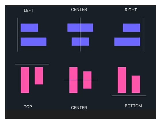
Alignment is the first step for a good layout. The grid is the structure formed by the layout, it’s the way of organizing elements on a page to put them in a recognizable structure. In designs, grid is implied not drawn and gives the audience a sense of clarity.
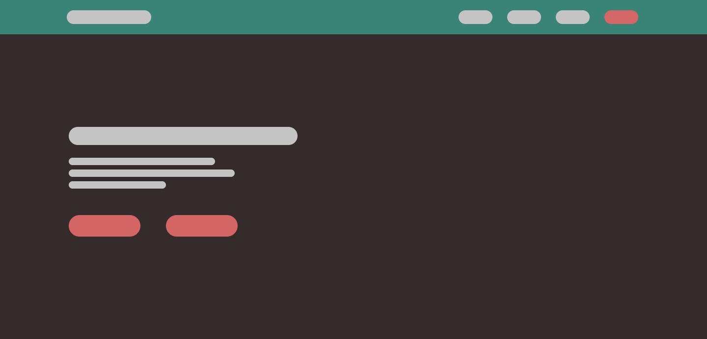
Using Figma to practice alignment and Grid with no images and texts.
2) Proximity
Most designers spread elements in a design page just because they feel the elements has to fill up the space but this is not true. Design actually likes grouping things together especially when they have something in common. Related things should be placed together why unrelated things should be apart from each other.
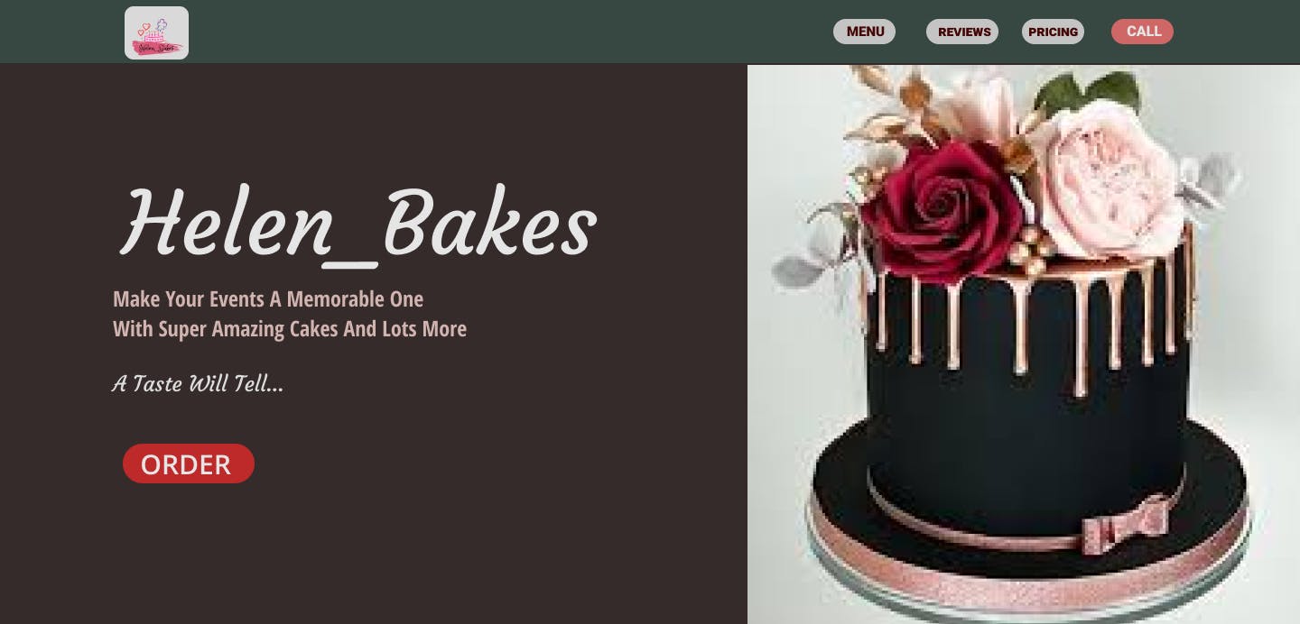
Here, I completed the page by fixing texts and images to show proximity
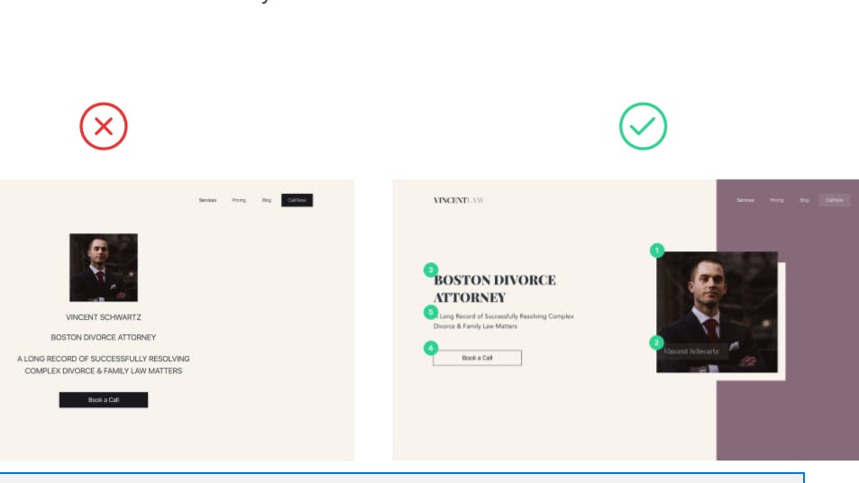
3) Visual Hierarchy
It is a fundamental principle of a good design. our eyes cannot focus on too many things at a time. It has to do with the way our attention works. It has to do with what your eye catches first in an entire design. The hierarchy in design begins with a focal Point. The main message of the design should catch the eye first and steal so much attention from the audience. A visual hierarchy contributes to the beauty of a design. Sizes and weights of texts, images are what usually define the hierarchy but colour contrast is also important.
4) Typography
Every website out there has text on it. And a lot of design depends on how we select the text styles. This is called typography. Typography isn't just choosing the right font. It's about choosing the combination of those fonts. The different styles: like skinny, and bold, and regular, and weight.
Tips
Paid fonts obviously are more superior option if you can afford it. One benefit of a premium font is that it can give your project more unique feel. This is because they are not as popular and they're not as overused. Adobe Fonts is included in their creative cloud subscription. These are subscriptions to Photoshop, Illustrator and other Adobe software.
Google fonts are also super cool. It's free, no licensing worries, they are well designed, it's curated by Google. And both Figma and Webflow already come with it. Visit fonts.google.com
Choosing right typefaces and fonts for the right context is like dressing appropriately for an occasion. You don’t want to look underdressed or overdressed. This might make you feel uncomfortable while you lose focus or even have to deal with the eyes of fellow guests.
Typography can make a website look great and with outstanding readability, or it can make it childish-looking, or maybe out of context, or look confusing and very hard to read. The difference between typeface and font In this case is; Helvetica is a typeface family that has many different font styles in it, like Light, Bold and so on. Palatino, Open sans, arial, etc. are all typefaces The personality of a typeface is as important as choosing the right outfit for the right occasion.
5)Colours
Picking good colours is a very good thing in design and a very important skill. a little tip could be to steal colours instead of picking colours from your heart. inspirations can be gotten from other designs from posters, websites and illustrations or even from real world photos. sampling colours from real world; nature, animals, flowers or wishing nature will always give you great results.
SAMPLING COLOURS
Colors can make or break any design We are attracted to the colors that we like, and quite repelled by those that we don't. Picking good colors is only half of the job. The second half is actually matching the right colors together. Using real world as our inspiration solves this problem too. This is because most of the time, natural world provides great color combinations.
Tool: Figma
We can sample a few dominant colors from the image and now, we have a color palette that is natural and harmonious.

One place to find color inspiration – dribbble.com. You can find excellent inspiration in here. When we find colors that we like, we can sample the color using a colour picker from our system. In Mac the eye dropper tool is inside utilities called DIGITAL COLOUR METER. In Pc we can use chrome browser extensions like colorZilla. Another way to generate colour pallets is through colour generated sites like coolors.com
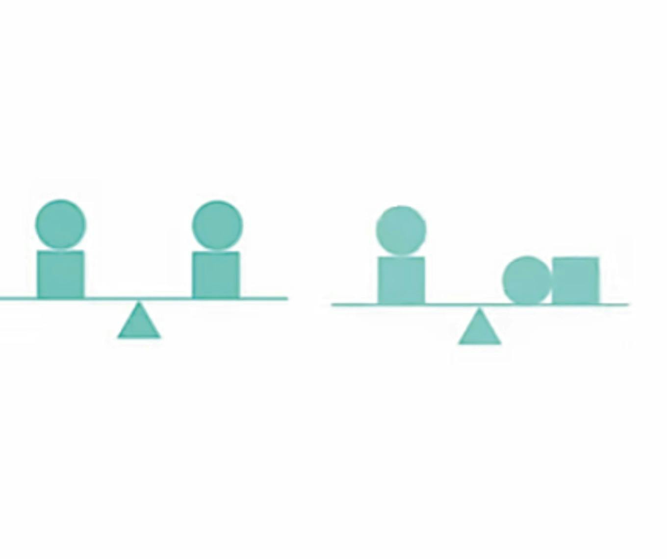
6) Balance
Balance is a state of equilibrium. The concept of visual equilibrium. In design, balance is the distribution of visual weight of objects, colours, texture, and space is when the visual weight is distributed in a way that makes the composition feel stable.
Balance is of Two Types
Symmetrical Balance Symmetrical balance is when an artwork is divided into two and it looks the same on both sides.
Asymmetrical Balance A type of balance in which the two sides of the art work are different, but still stable
Using more of Symmetry can be boring sometimes while asymmetry looks interesting in some cases.
7) Repetition
Repetition creates visual beat. Lines, Typeface style, Fonts, Colours, Size, Scale, Texture, and Language can give a good sense in design when repeated.
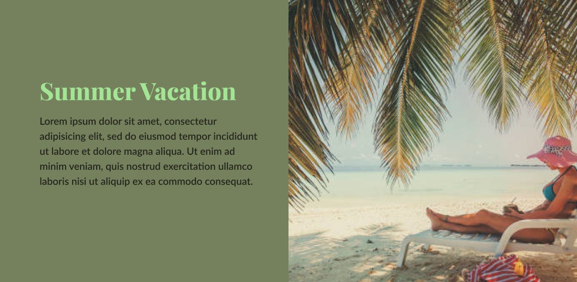
8) White Space
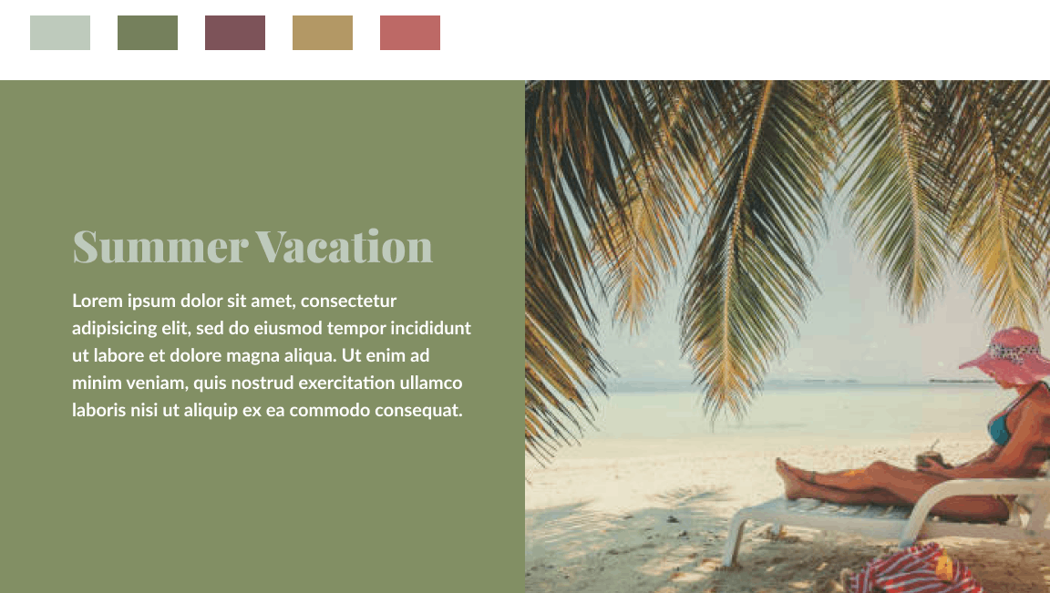
White Space creates a sense of grouping and adds emphasis and legibility to a design. It gives the design breathing space. White space does not necessarily mean ‘WHITE’. It could also be a free yellow space in a design. For instance, there is white space around the texts in the ‘SUMMER VACATION’ design below. Texts are not scattered throughout the page to cover the entire page.
9) Movement
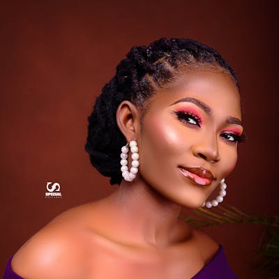
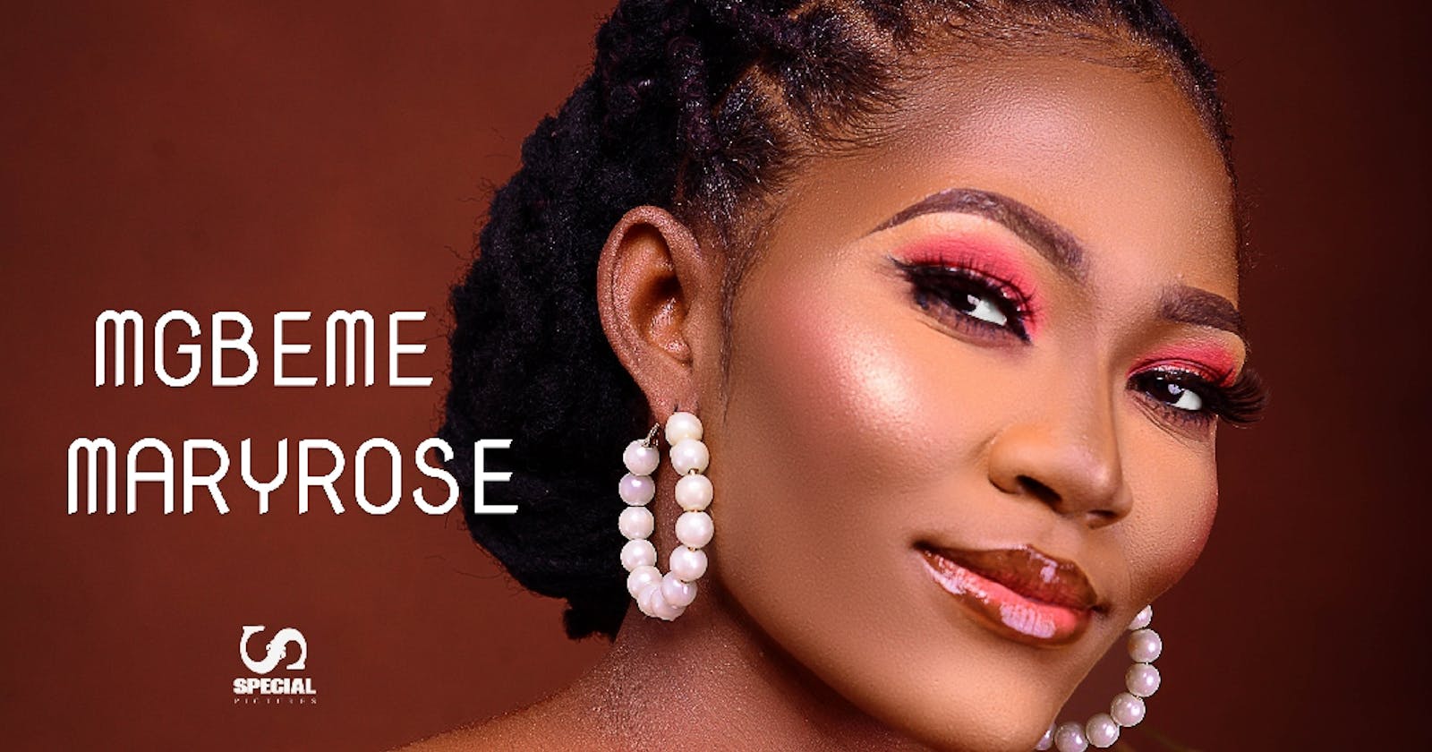
The path the viewer’s eye take through an artwork. Movement can be directed along Lines, Edges, Shapes, Colours. The eye targets the most obvious and emphasized part of the design first, secondly to other parts it finds interesting and down to the less obvious and less emphasized part of the design. A viewer’s eyes will most certainly move from the Lady sitting in the picture above to the palm branches and the beach through the texts in the design.
There are other design rules out there but these are the ones I want to share with you. Kindly react to this article.
Thanks for Reading!